shadcn/ui: component library building platform
General Introduction
shadcn/ui is an open source component library building platform that provides beautiful and customizable UI components that users can copy and paste into their applications. The platform supports a variety of front-end frameworks , and provides detailed installation and usage guide to help developers quickly get started and build their own component library .
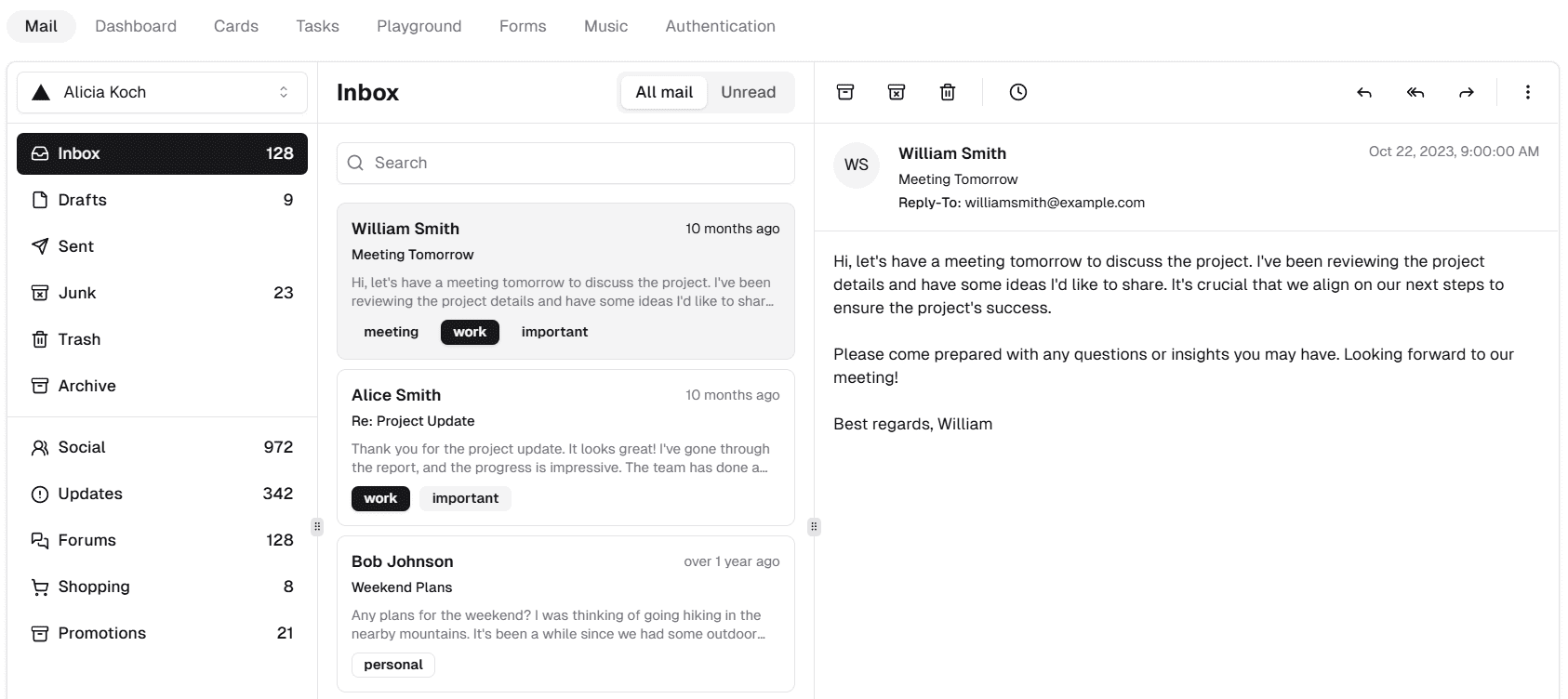
Function List
- Provide a variety of beautiful UI components
- Support for multiple front-end frameworks (e.g. Next.js, Vite, Remix, etc.)
- Provides TypeScript and JavaScript versions of the component
- Detailed installation and usage instructions
- Open source and free to use
Using Help
Installation process
- Selection Framework: Choose supported frameworks such as Next.js, Vite, Remix, Gatsby, Astro, Laravel, etc. based on project requirements.
- Installation of dependencies: Install the required dependencies using npm or yarn.
npm install @shadcn/ui - Configuration items: Configure the project files according to the requirements of the selected framework. For example, configure the TypeScript or JavaScript version, set up Tailwind CSS, etc.
{ "style": "default", "tailwind": { "config": "tailwind.config.js", "css": "src/app/globals.css", "baseColor": "zinc", "cssVariables": true }, "rsc": false, "tsx": false, "aliases": { "utils": "~/lib/utils", "components": "~/components" } } - Importing components: Import and use the required components in your project.
import { Button } from '@shadcn/ui';
Guidelines for use
- Browse component libraries: Visit the shadcn/ui official website to browse the available components and choose the one that suits your project needs.
- Copy and paste component code: Copy and paste the component code provided on the official website into the project and make the necessary customizations.
- Custom Components: Customize the style and functionality of the component according to the project requirements. shadcn/ui provides rich configuration options and supports style customization via Tailwind CSS.
- Testing and debugging: Test the functionality and style of components in a project to ensure they meet expectations.
- Publishing Projects: After completing component integration, build and release the project.
Detailed Operation Procedure
- Installation of dependencies: Ensure that the necessary dependency packages such as React, Tailwind CSS, etc. are installed in the project.
- configuration file: Configure the tsconfig.json or jsconfig.json file according to the project requirements, set path aliases, and so on.
- Importing components: Import and use components provided by shadcn/ui in files that need to use them.
- Custom Styles: Customize the appearance of components using Tailwind CSS or other styling tools.
- Debugging and Optimization: Debugging and optimization of components during development to ensure performance and compatibility.
© Copyright notes
Article copyright AI Sharing Circle All, please do not reproduce without permission.
Related posts

No comments...

