Julius's How-To Guide
Step 1: Connect to the data source
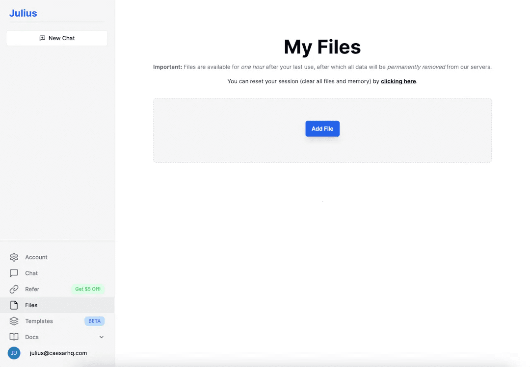
Visit [My Documentstab, and then click the "Add File" button in the center of the screen. Select Upload File to upload any file in any format for Julius to analyze or edit, whether it's a CSV, Excel, JSON file, or multimedia file. You can also choose to connect to Google Sheets via URL sharing.After uploading or submitting, the data source will appear in your list of data sources.
Step 2: Create a session
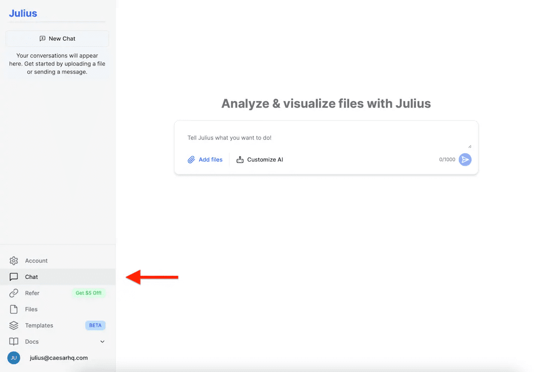
After adding the data source, you can go to [chats] page. You'll find an easy-to-navigate list of sessions on the left.
Step 3: Set up active data sources
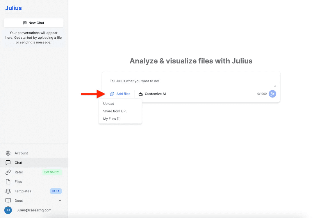
Select an existing data source, or add a new one by clicking the "Add File" button. Then, enter your initial instructions and click the blue arrow button to send a message to start your first session.
Step 4: Analyze and transform data
Once the data source is connected and the session is started, you can ask Julius to use natural language commands to analyze and change the data. Let's say you could ask, "Show the average sales for each product category," or "Sort the data by customer age." Julius will convert your commands into Python code and process the data. You can perform any operation supported by pandas dataframes, including filtering, sorting, integrating, performing regressions, and more.
Step 5: Presentation of data
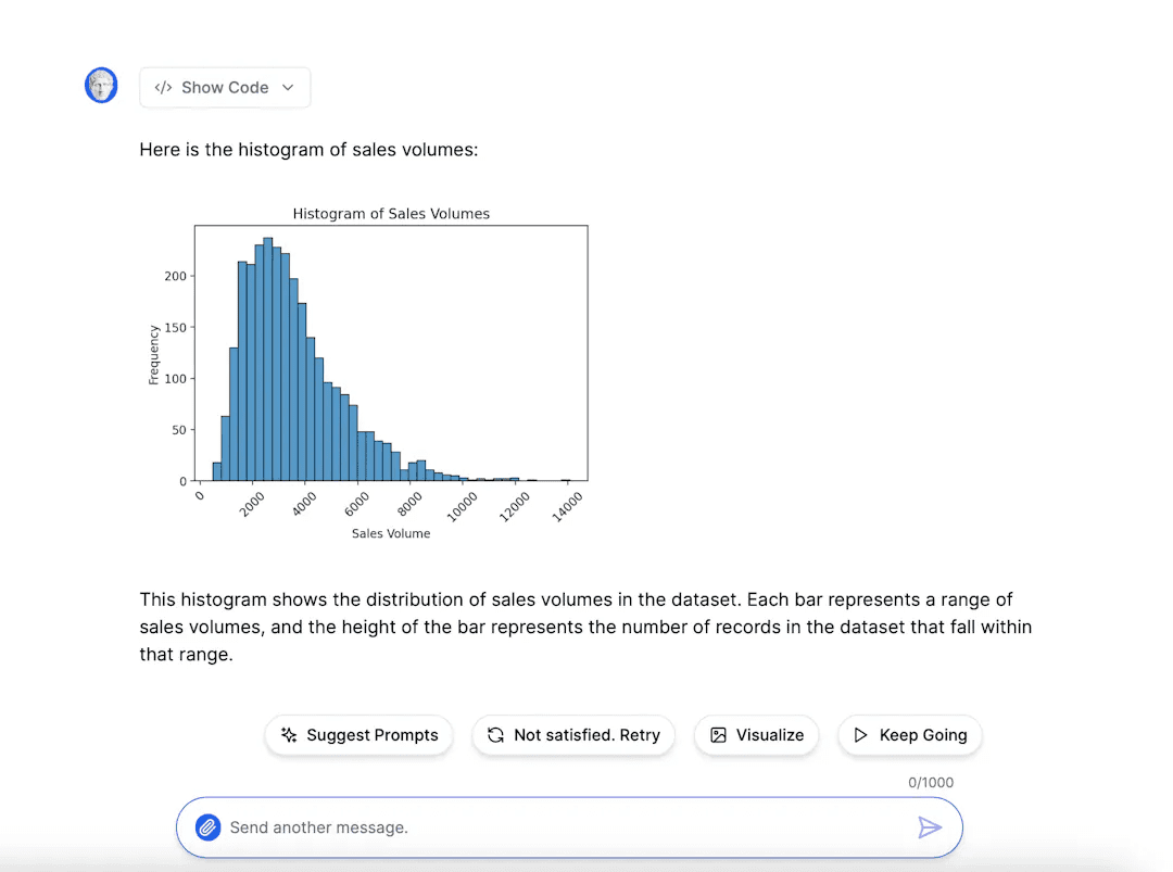
You can have Julius create visual renderings based on your data. You can request various types of graphics, including but not limited to:
Bar graph: Compare the volume of various categories. For example, "Show me a bar graph of sales by item category."
Line graphs: Show trends over time. For example, "Show me a line graph of the change in sales."
Histogram: Show the distribution of variables. For example, "Show me a histogram of customer ages."
Scatterplot: Show the relationship between two variables. For example, "Show me a scatter plot of age and income."
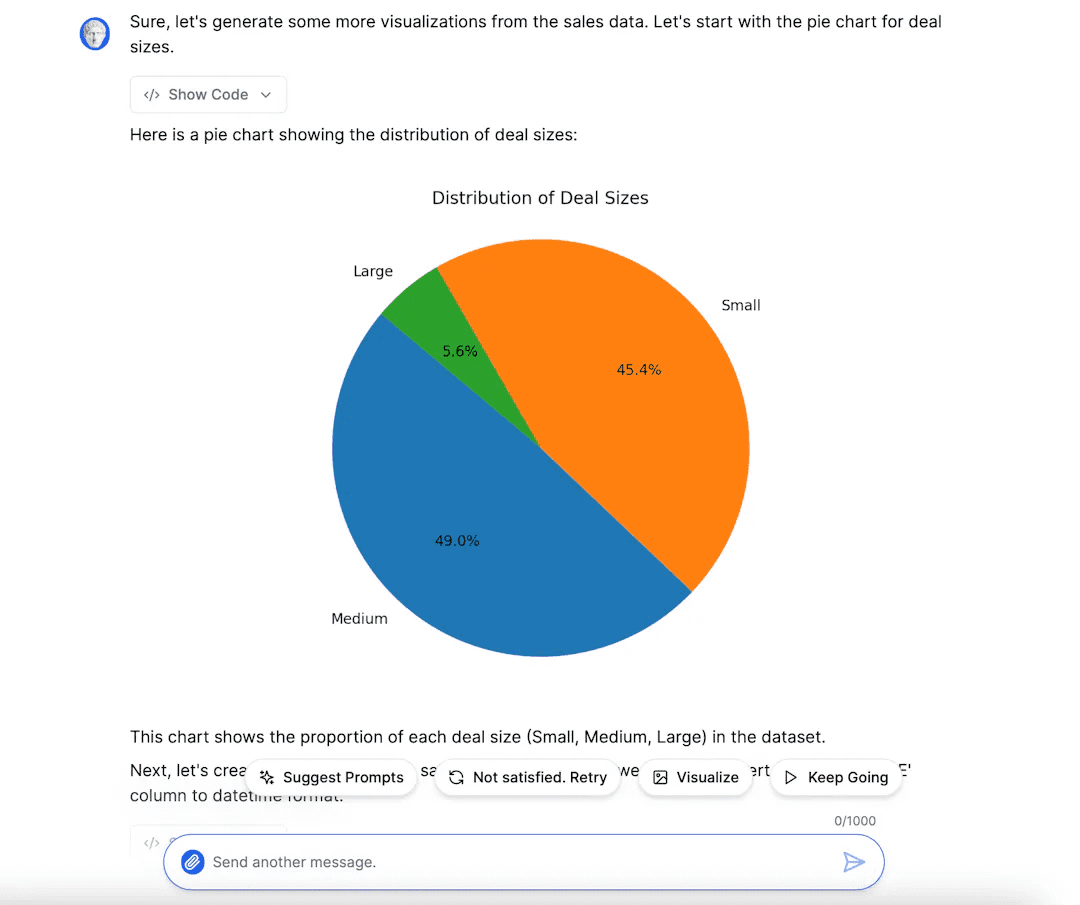
Pie chart: Show the proportions of each category. For example, "Show me a pie chart of sales distributed by region."
Julius will produce the graph at your request and display it in the chat window. You can right-click on the image to copy or save it if you want to use the graph elsewhere.
Step 6: Exporting data
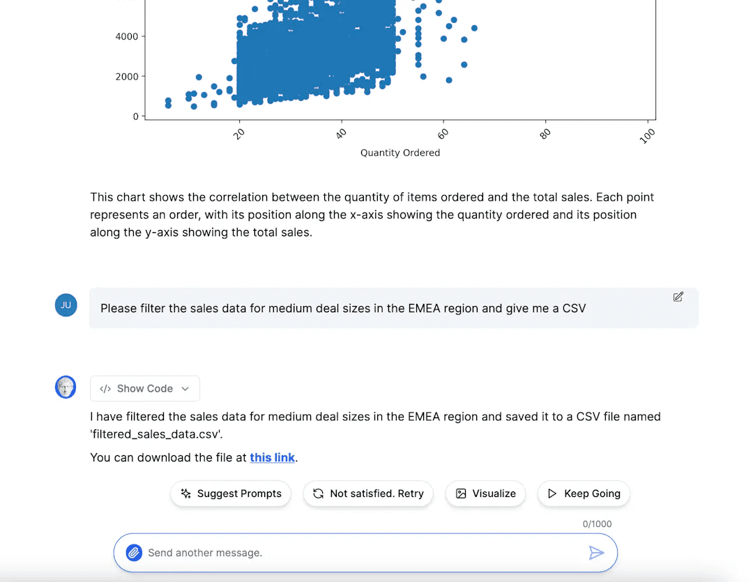
If you have made changes to the data and wish to export it, tell Julius to export the data. Give the export file a name and indicate the format you want the data in -- CSV or Excel file. The chat window will generate a link which will take you to a page where there is a download button for the export file.
© Copyright notes
Article copyright AI Sharing Circle All, please do not reproduce without permission.
Related posts

No comments...


